Dynamically select measures to be shown on a Power BI visual via slicer
A few days ago a client asked me if it is possible to dynamically change series displayed on Power BI chart. My first (instinctive) answer was “Yes, of course, you can use a slicer to select which series you want to show, just put desired column in a slicer visual”. But then he added details: he wanted to select a measure to display on a chart, not to filter a value from column. My second (instinctive) answer was “No, you can’t. You can only filter a column, and can’t place measures in a slicer”.
But after a little chat I started to wonder whether it is really impossible. If we put a measure in a “Value” well of chart fields, it will be shown as a series (for example, some [Total Amount] measure). What my client is actually wants? He want to choose some elements on the slicer and, if one element selected, to show a measure. If that element is unchecked, then don’t show a measure.
Actually, those slicer’s elements are unique values from some column. A slicer applies a filter to that column. Can we catch whether a column is filtered? Yes, of course, we can do it with DAX. And if some desired value is selected, we just need to show a measure as a series. As that measure is already in the “Value” well of a chart, then, in other words, we just have to “do nothing”. So, we only need to somehow hide a measure if a desired slicer’s element didn’t selected.
I only know one way to “hide” a measure value. Usually Power BI (or Power Pivot and simple Pivot Table) shows nothing for the BLANK values of measure.
So, here comes a solution:
If some value “A” is checked (selected) on a slicer, then measure calculates and displays as usual. If value “A” is unchecked (not selected) on a slicer, then measure should return a BLANK().
After this logic was unraveled, the implementation became quite easy.
First, we need a special disconnected SlicerTable with at least one [SlicerColumn] column, and a [RawMeasure] which actually make all calculations needed. Then we make a new (I shamelessly call it “shy”) measure, which will behave as described above.
Here is a one of possible patterns for “shy” measures:
IF (
COUNTROWS (
CALCULATETABLE (
SlicerTable,
SlicerTable[SlicerColumn] = “Beautified Measure Name”
)
)
> 0,
[Raw Measure],
BLANK ()
)
There is a little bit shorter measure, I think, it is even better:
Shy Measure for Slicing on a Chart =
IF (
CONTAINS (
‘SlicerTable’,
SlicerTable[SlicerColumn], “Beautified Measure Name”
),
[Raw Measure],
BLANK ()
)
To test these measures I’ve opened Power BI Desktop and created a simple table with unique name ‘Table1’ (dates there in DD.MM.YYYY format) via “Enter Data” button:
| Name | Dates | Score |
| John | 01.01.2017 | 5 |
| John | 01.02.2017 | 7 |
| John | 01.03.2017 | 6 |
| John | 01.04.2017 | 8 |
| John | 01.05.2017 | 8 |
| John | 01.06.2017 | 5 |
| Jack | 01.01.2017 | 7 |
| Jack | 01.02.2017 | 9 |
| Jack | 01.03.2017 | 8 |
| Jack | 01.04.2017 | 7 |
| Jack | 01.05.2017 | 6 |
| Jack | 01.06.2017 | 5 |
| Jenny | 01.01.2017 | 9 |
| Jenny | 01.02.2017 | 10 |
| Jenny | 01.03.2017 | 6 |
| Jenny | 01.04.2017 | 7 |
| Jenny | 01.05.2017 | 8 |
| Jenny | 01.06.2017 | 9 |
And then created another ‘SlicerTable’ table:
| SlicerColumn | SlicerOrder |
| Average Score | 2 |
| Total Score | 1 |
After loading these tables to a model, I’ve created two simple “raw measures”:
AvgScore =
AVERAGE ( Table1[Score] )
TotScore =
SUM ( Table1[Score] )
Then we need to create a “shy” version of the each measure:
Average Score =
IF (
CONTAINS ( ‘SlicerTable’, SlicerTable[SlicerColumn], “Average Score” ),
[AvgScore],
BLANK ()
)
Total Score =
IF (
CONTAINS ( ‘SlicerTable’, SlicerTable[SlicerColumn], “Total Score” ),
[TotScore],
BLANK ()
)
Ok, lets add some visuals and a slicer.
I choose a simple bar chart with Names on X-axis, and a “Line chart” with dates on X-axis, and put my “shy” measures in the values:

Two simple charts to test
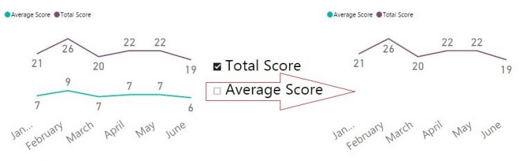
All we need now is too create a slicer with the [SlicerColumn] from the ‘Slicer’ table and test it:
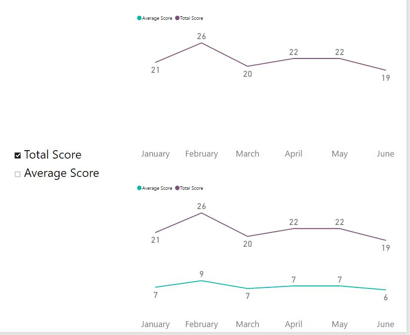
Test for Line chart
We’ve got it! Our new measure hides if unchecked on the slicer, and appears if checked.
The same behavior we can see on other charts:
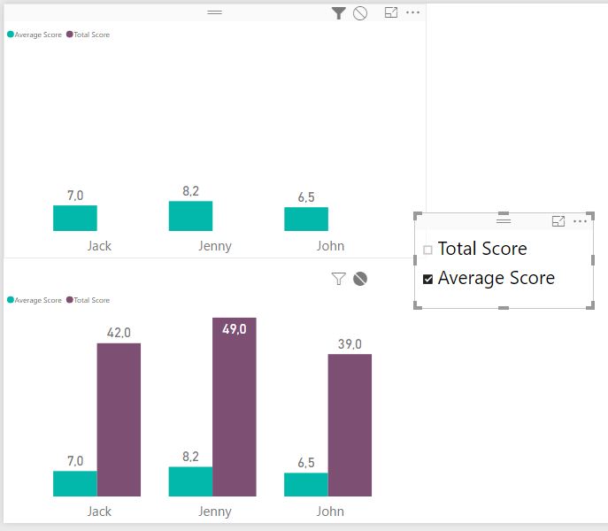
Test for Bar Chart
You see, it is easy.
The only issue I’ve found Is that on “Line chart”, when we select only one measure, which is the first in the ‘Value’ well of visual, the Legend mystically disappeared, but if we select any other, all or none of slicer values, Legend comes back.
I also highly recommend this nice community blog post by Sam McKay “Dynamically change the information within a visual via a slicer”, where he described a way to select only one measure to be shown on a chart. I’ve discovered his post after I finished my solution for the same task. Don’t be like me and don’t reinvent a bicycle. Google before, not after.
DAX code in this post beautified with the lovely and charming www.daxformatter.com
A good reading for you:
Follow me:Share this: