Dynamically select measures to be shown on a Power BI visual via slicer
A few days ago a client asked me if it is possible to dynamically change series displayed on Power BI chart. My first (instinctive) answer was “Yes, of course, you can use a slicer to select which series you want to show, just put desired column in a slicer visual”. But then he added details: he wanted to select a measure to display on a chart, not to filter a value from column. My second (instinctive) answer was “No, you can’t. You can only filter a column, and can’t place measures in a slicer”.
But after a little chat I started to wonder whether it is really impossible. If we put a measure in a “Value” well of chart fields, it will be shown as a series (for example, some [Total Amount] measure). What my client is actually wants? He want to choose some elements on the slicer and, if one element selected, to show a measure. If that element is unchecked, then don’t show a measure.
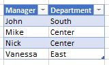
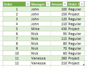
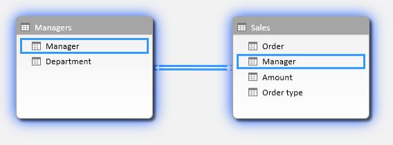
Actually, those slicer’s elements are unique values from some column. A slicer applies a filter to that column. Can we catch whether a column is filtered? Yes, of course, we can do it with DAX. And if some desired value is selected, we just need to show a measure as a series. As that measure is already in the “Value” well of a chart, then, in other words, we just have to “do nothing”. So, we only need to somehow hide a measure if a desired slicer’s element didn’t selected.
Follow me: